Reclaiming the Screen in Dynamics 365
Less scrolling
More of the work
Turning repeated customer feedback into a working prototype. I redesigned density, scrolling and summaries in Dynamics 365 so the information people need has room to breathe.
Explore the prototype (opens in a new tab)Password protected
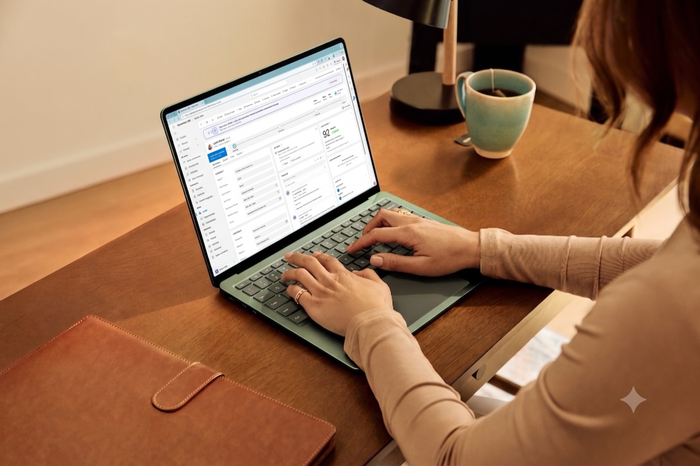
01 / At a glance
The header took the screen
A fixed header and summary could consume up to 245 pixels before the first field. Enterprise customers kept asking to see more information on a single page.
Make the problem measurable
I diagnosed four structural issues, designed the fixes and built a React prototype on Fluent controls to compare current and proposed states.
A concrete engineering conversation
Feature flags made each change reviewable with the same screen and data. Enterprise customers could validate the fixes directly.
02 / Design & leadership
Give the screen
back to the work
The prototype connects each customer complaint to a specific change that can be switched on and off.
Keep context. Reclaim space
As the page scrolls, the record header and summary collapse into a compact context bar. People keep their bearings while more of the record becomes visible.
Let people choose their density
Comfortable, Cozy and Compact presets sit alongside granular spacing controls in Personalization. Information density becomes a choice that fits the task.
Make summaries easier to read
Two disclosure levels replace three. A clear title, status, agent identity and refresh indicators create a consistent hierarchy in both collapsed and expanded states.
Build close to production
I reproduced the current experience with React and Fluent controls, then added the changes behind feature flags. The same prototype supports customer validation and gives engineering patterns it can carry into the product.
03 / What changed
From repeated feedback
to validated changes
This work is a customer-validated prototype and an implementation direction. The evidence comes from direct comparisons and customer conversations.
Review the actual change
The enterprise customers who raised the feedback could compare the proposed fixes directly with the existing experience.
Sequence the work
A measured layout study and feature flags turned broad feedback into specific, reviewable changes.
Prototype before committing
The approach established a way to validate experience changes before committing engineering investment.
Keep exploring
All projectsRPA AI Recorder
View project