View Live Project

AI Builder

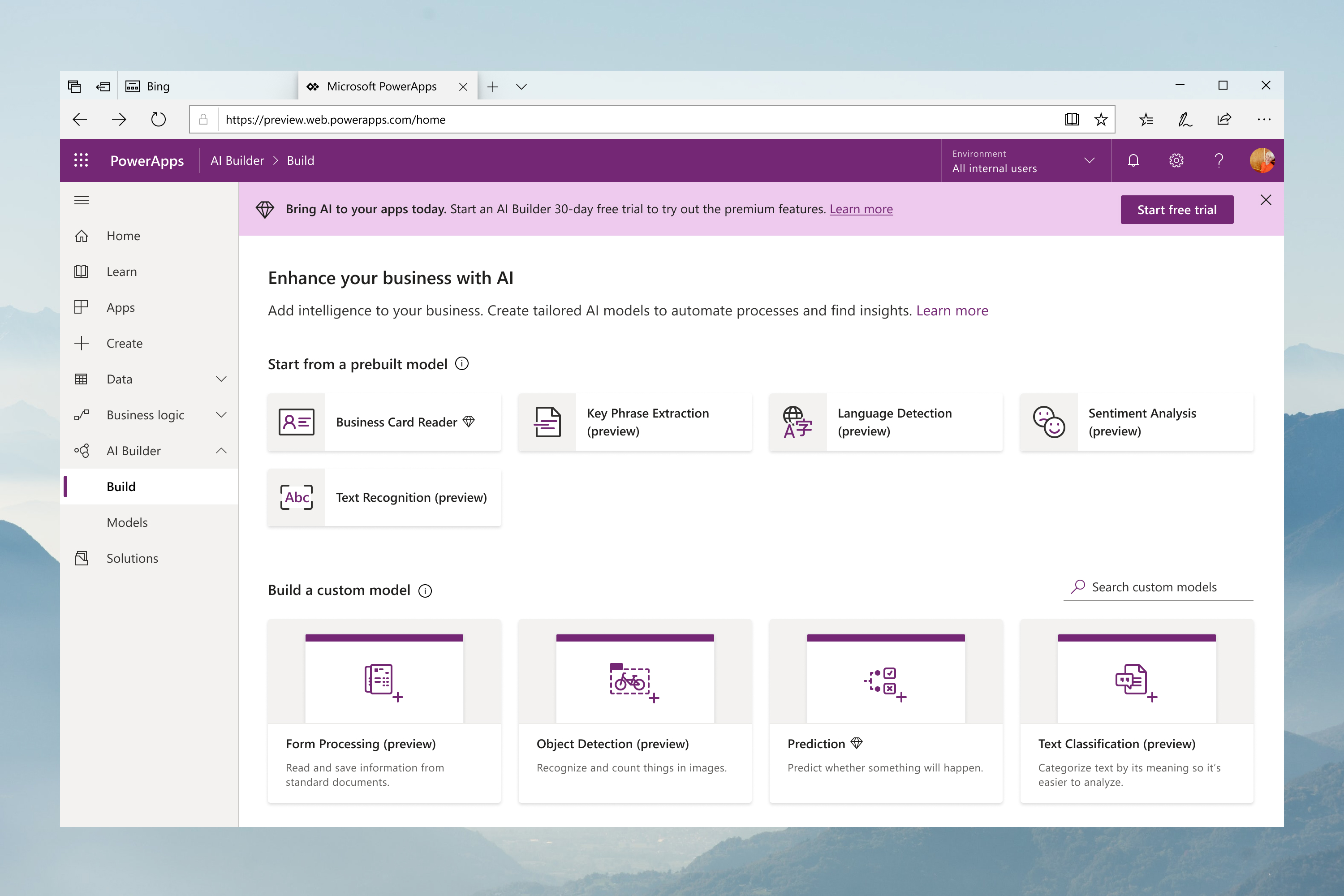
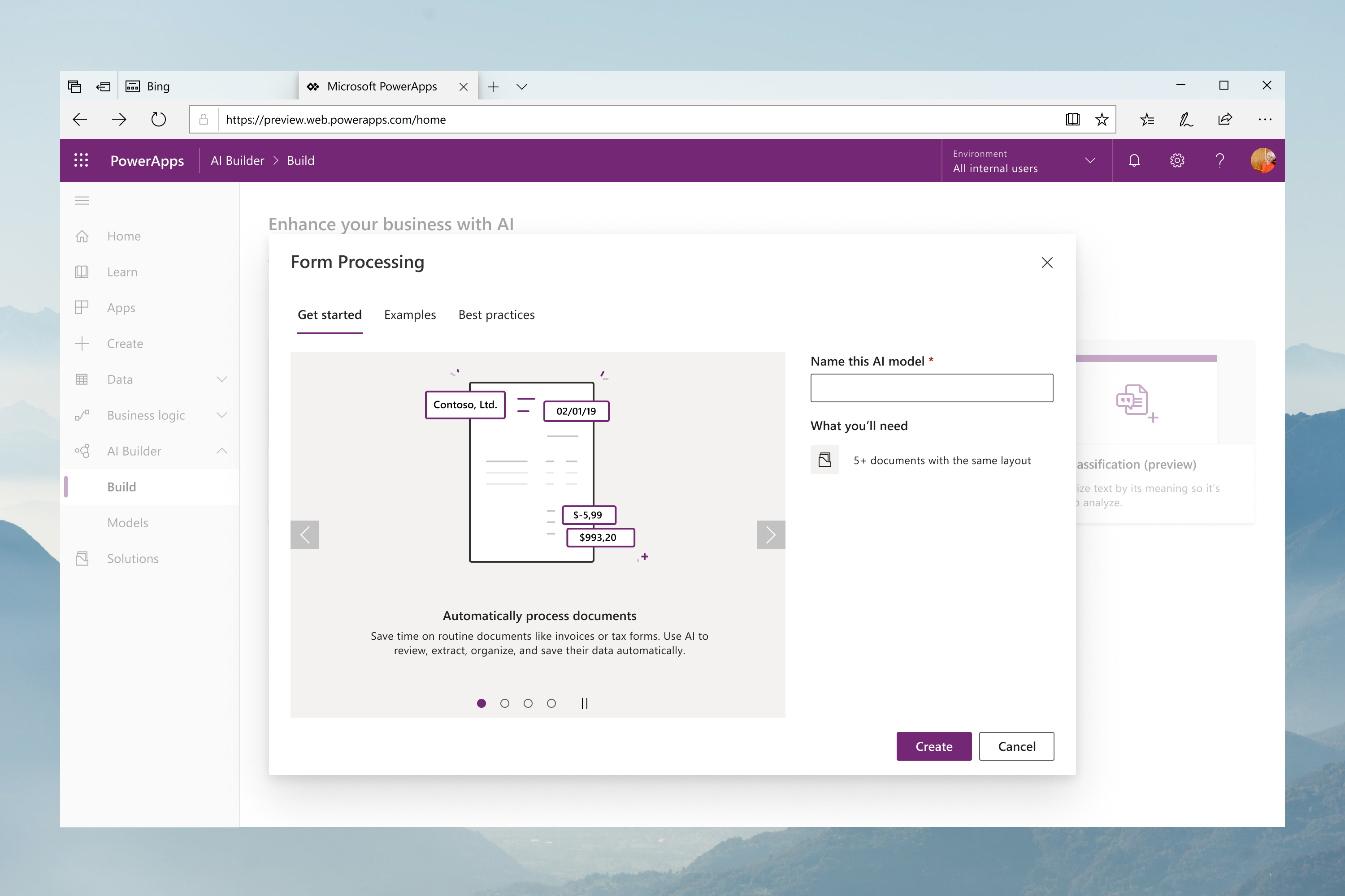
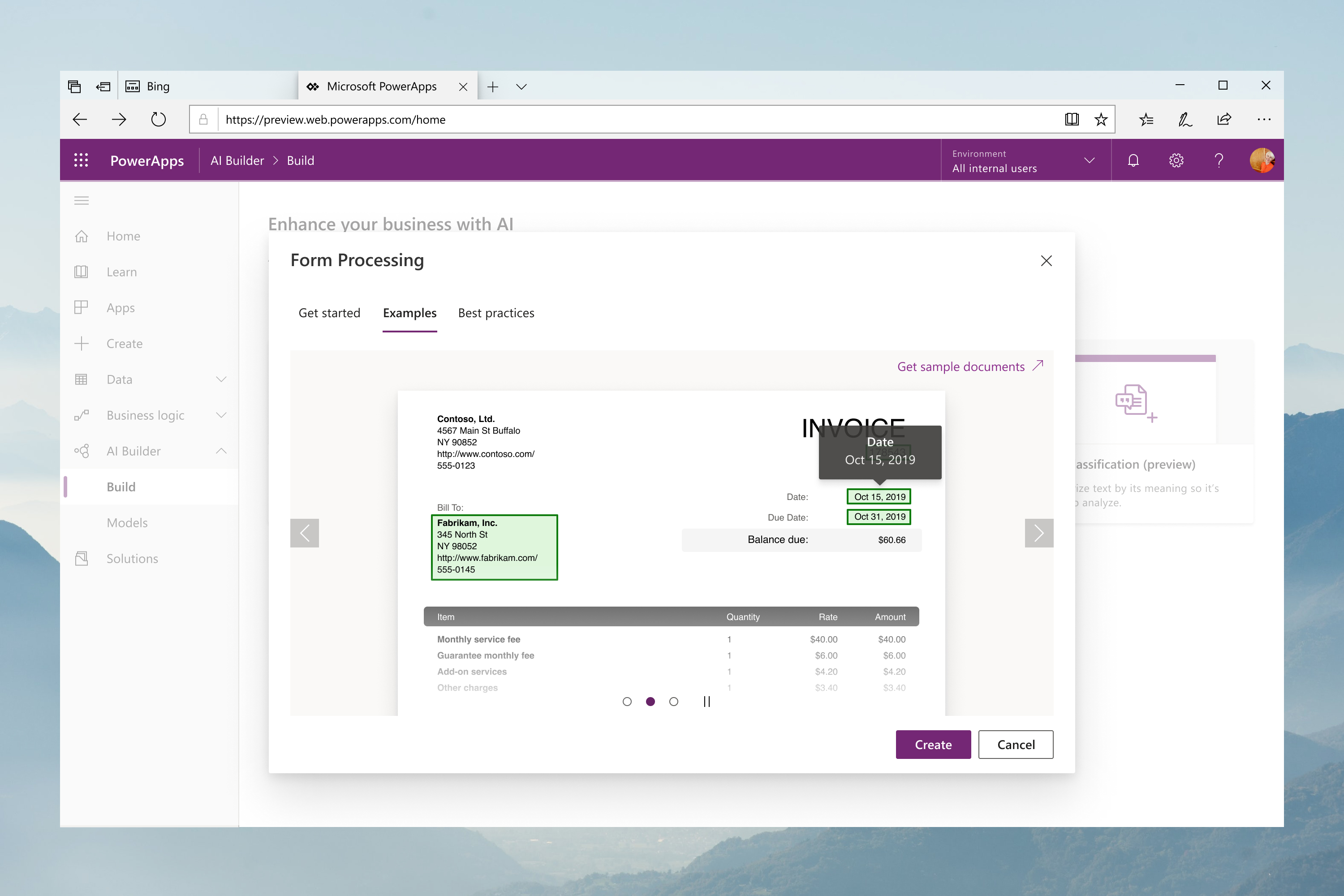
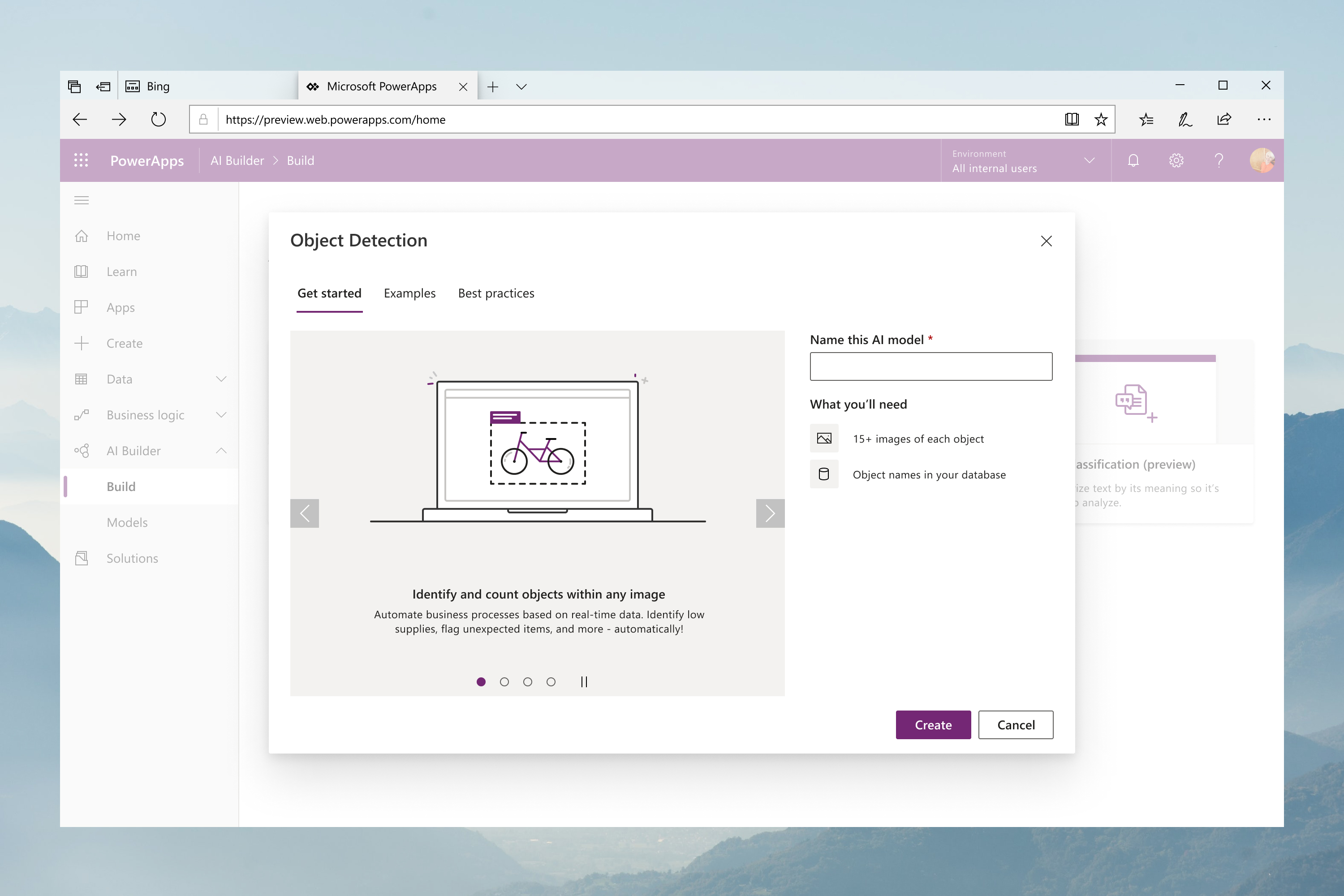
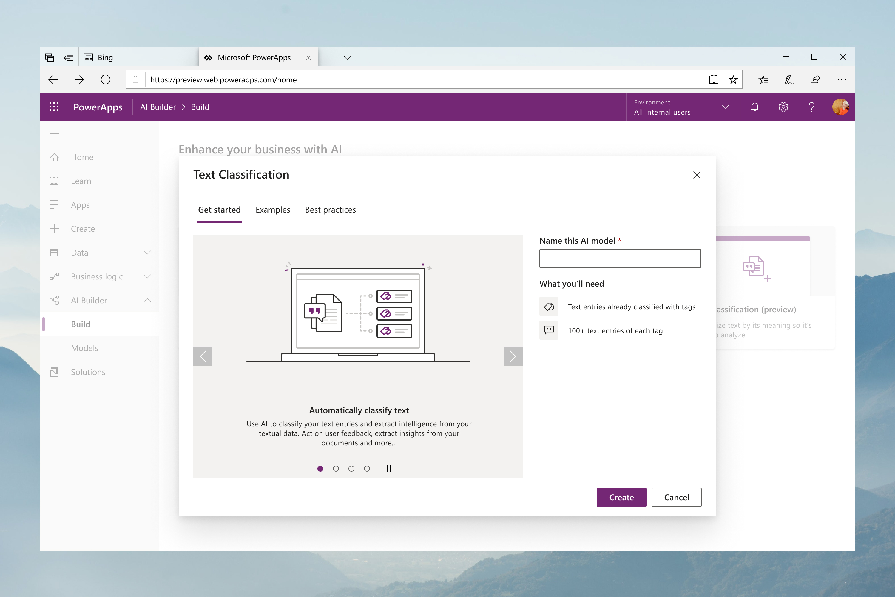
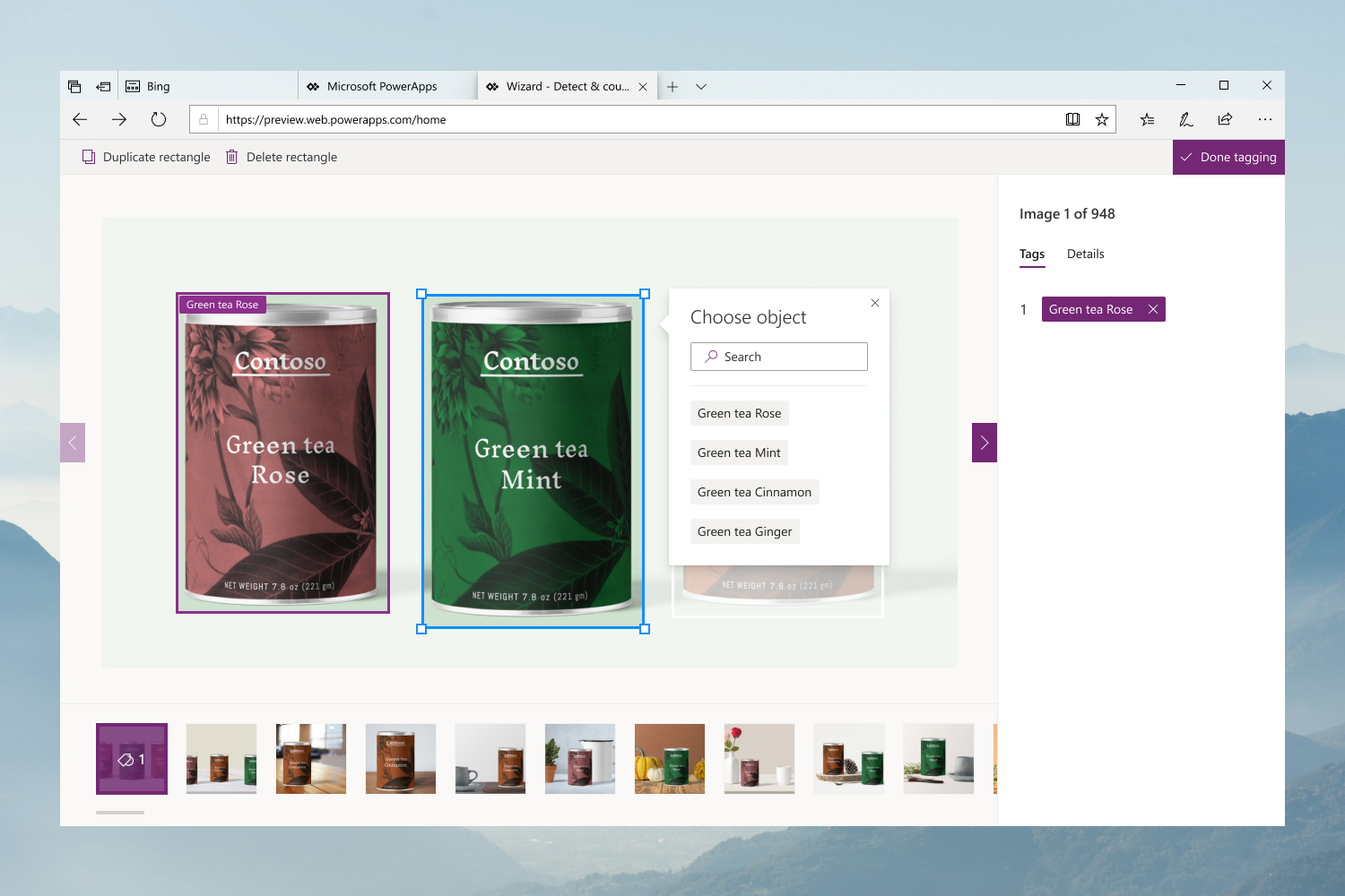
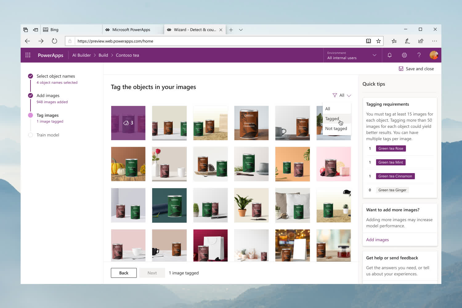
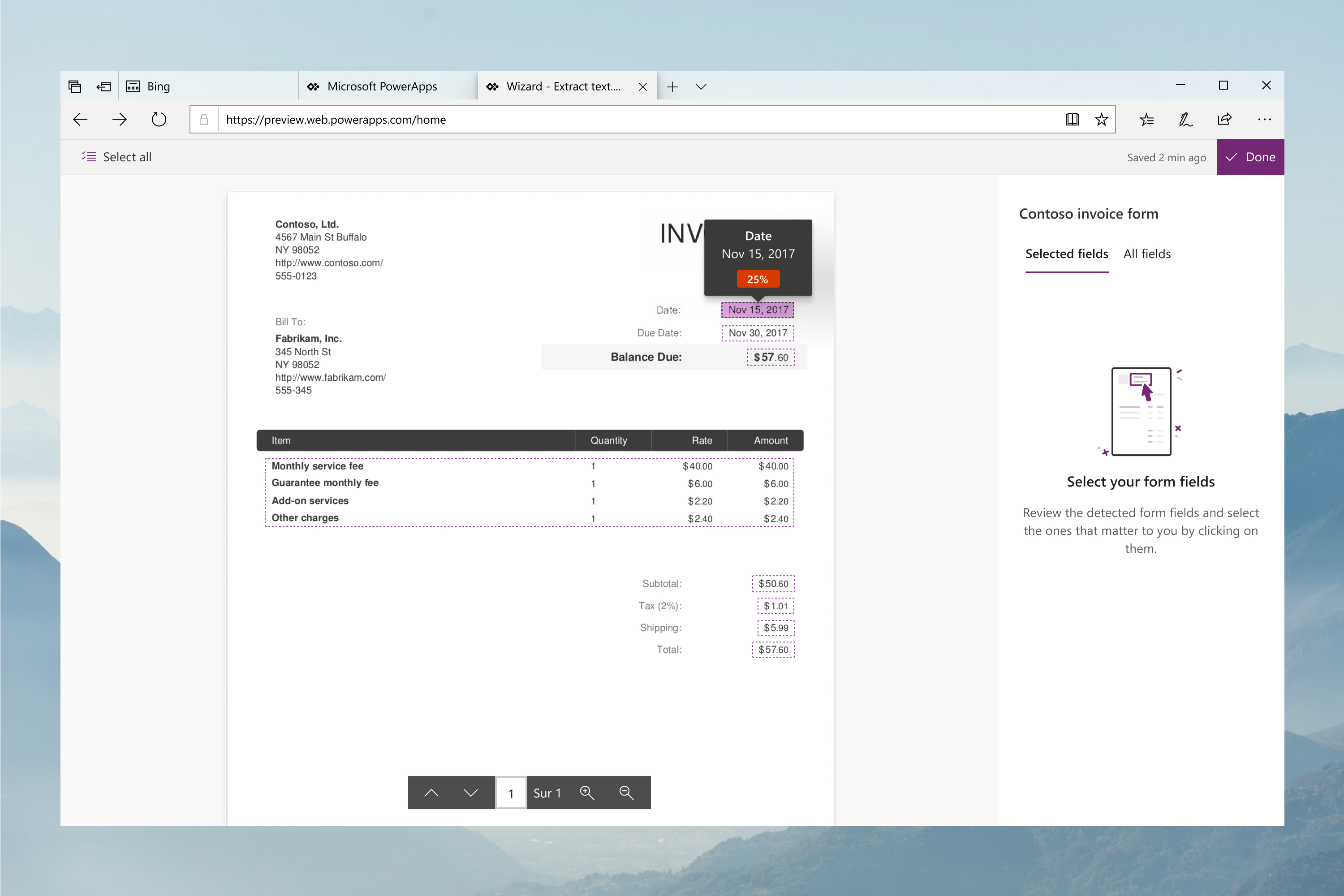
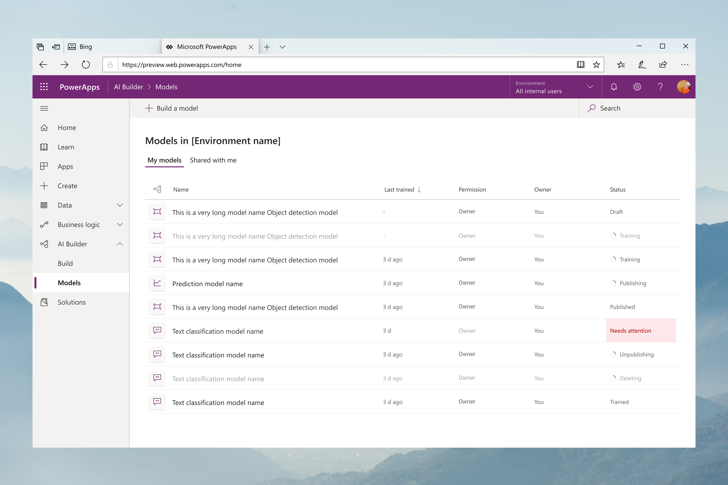
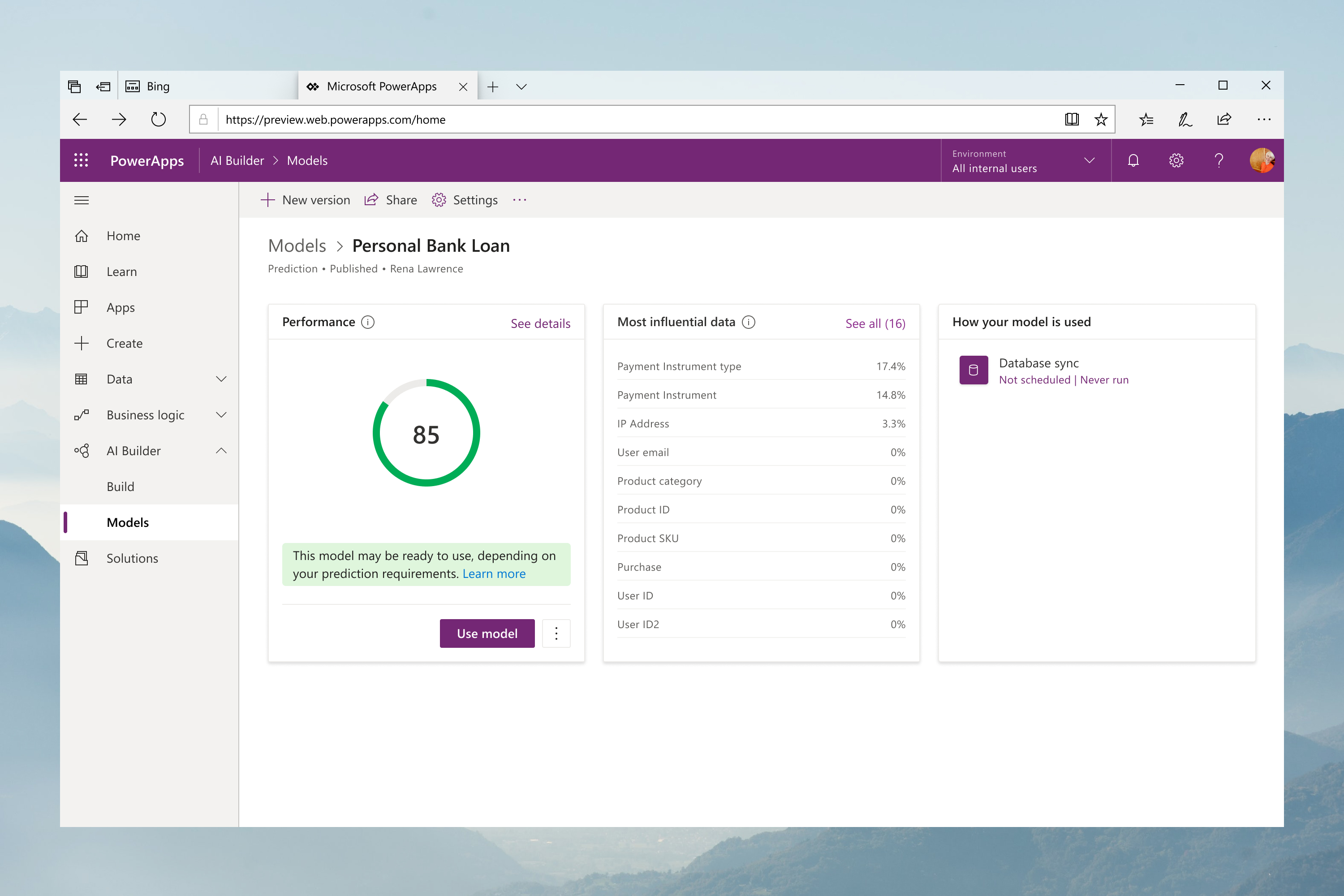
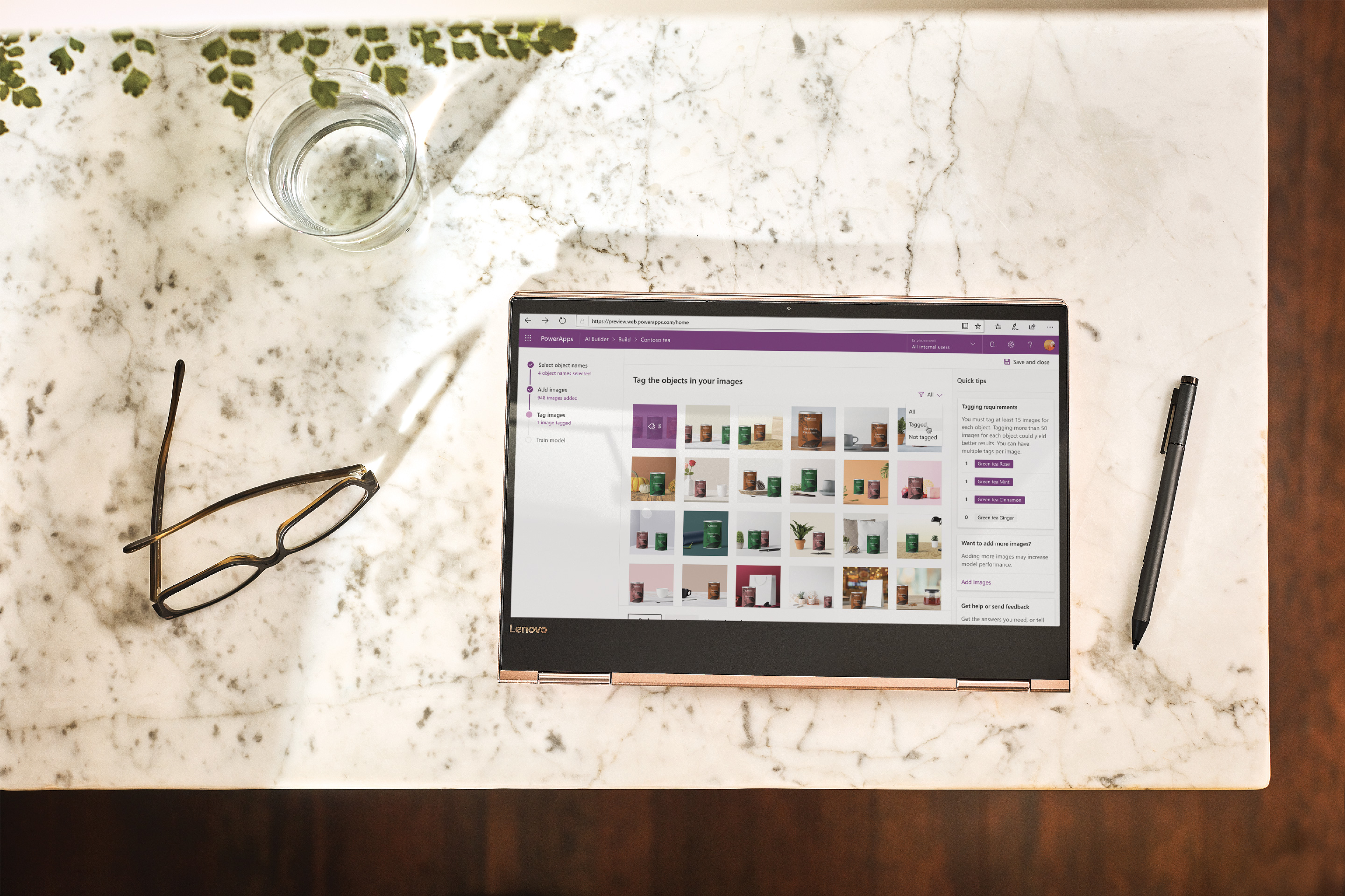
AI Builder is a new Power Platform capability that allows you to easily automate processes and predict outcomes to help improve business performance. AI Builder is a turnkey solution that brings the power of AI through a point-and-click experience. Using AI Builder, you can add intelligence to your apps even if you have no coding or data science skills.

See Live Project
Release
2019 - 2020
Role
Product Design Lead
Responsabilities
Art Direction
UX Design
UI Design
Prototyping
User Testing
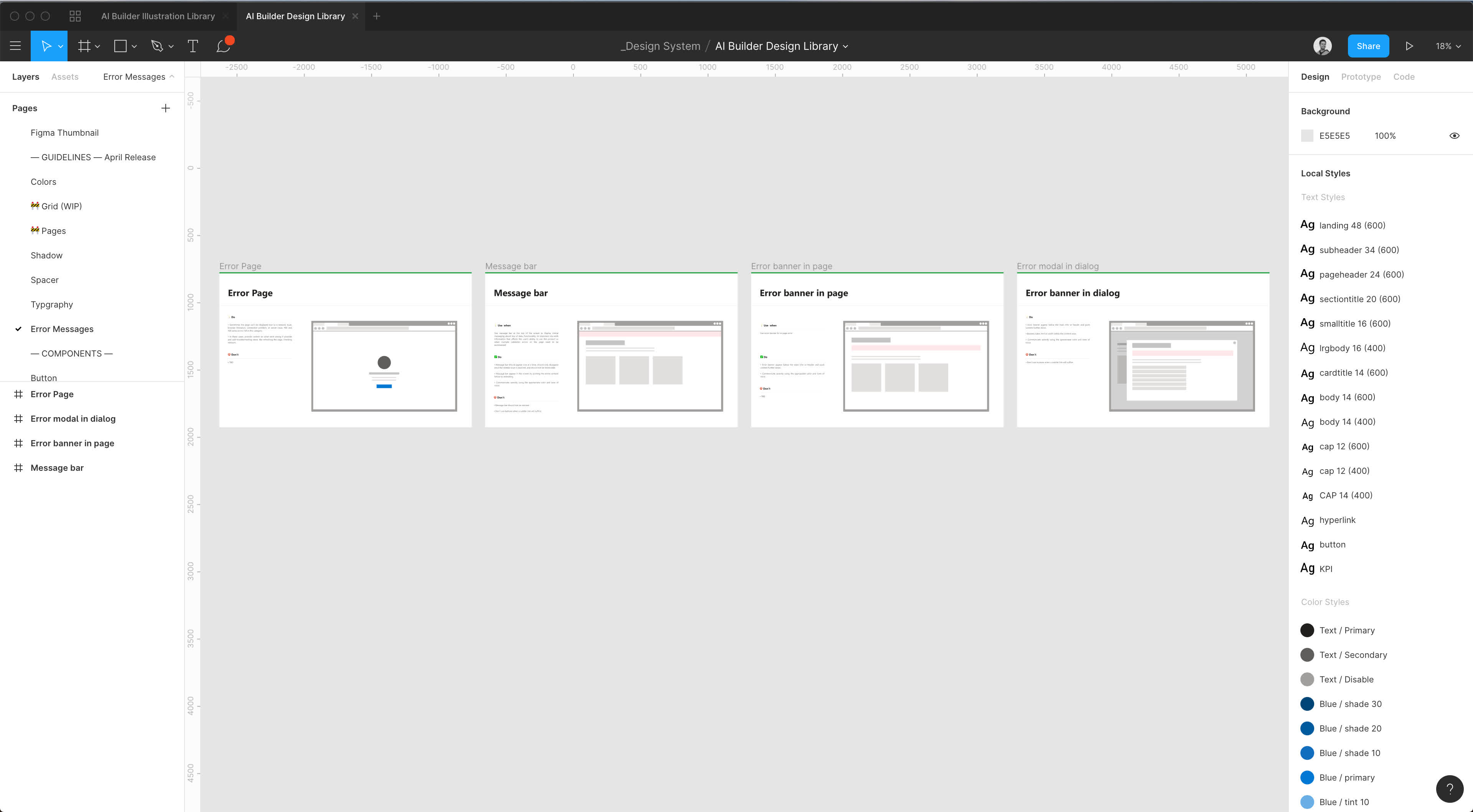
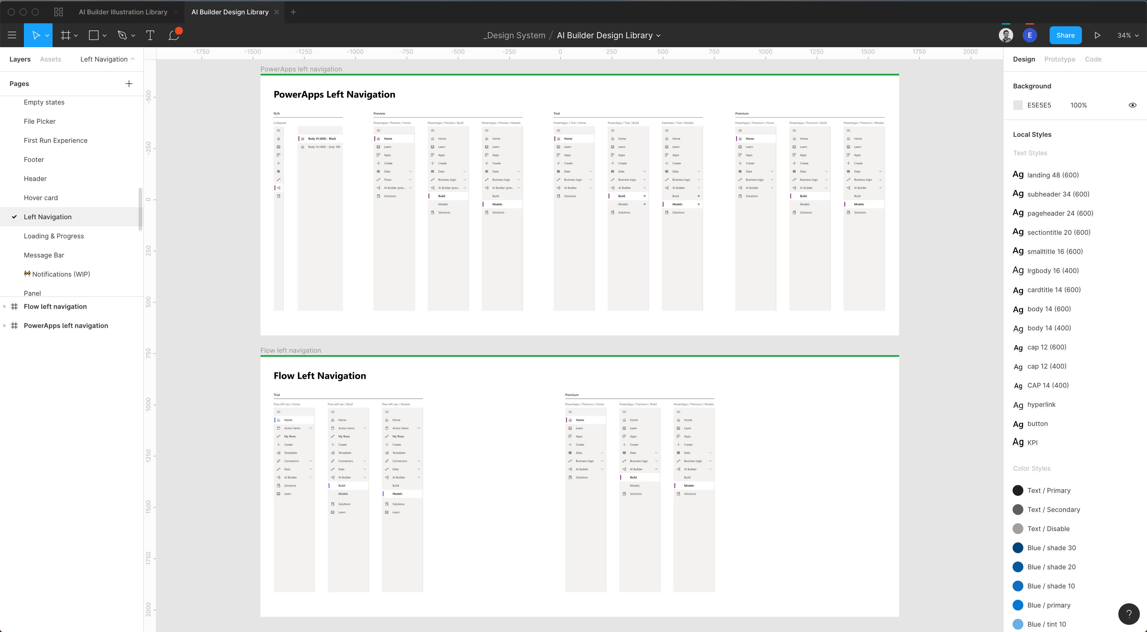
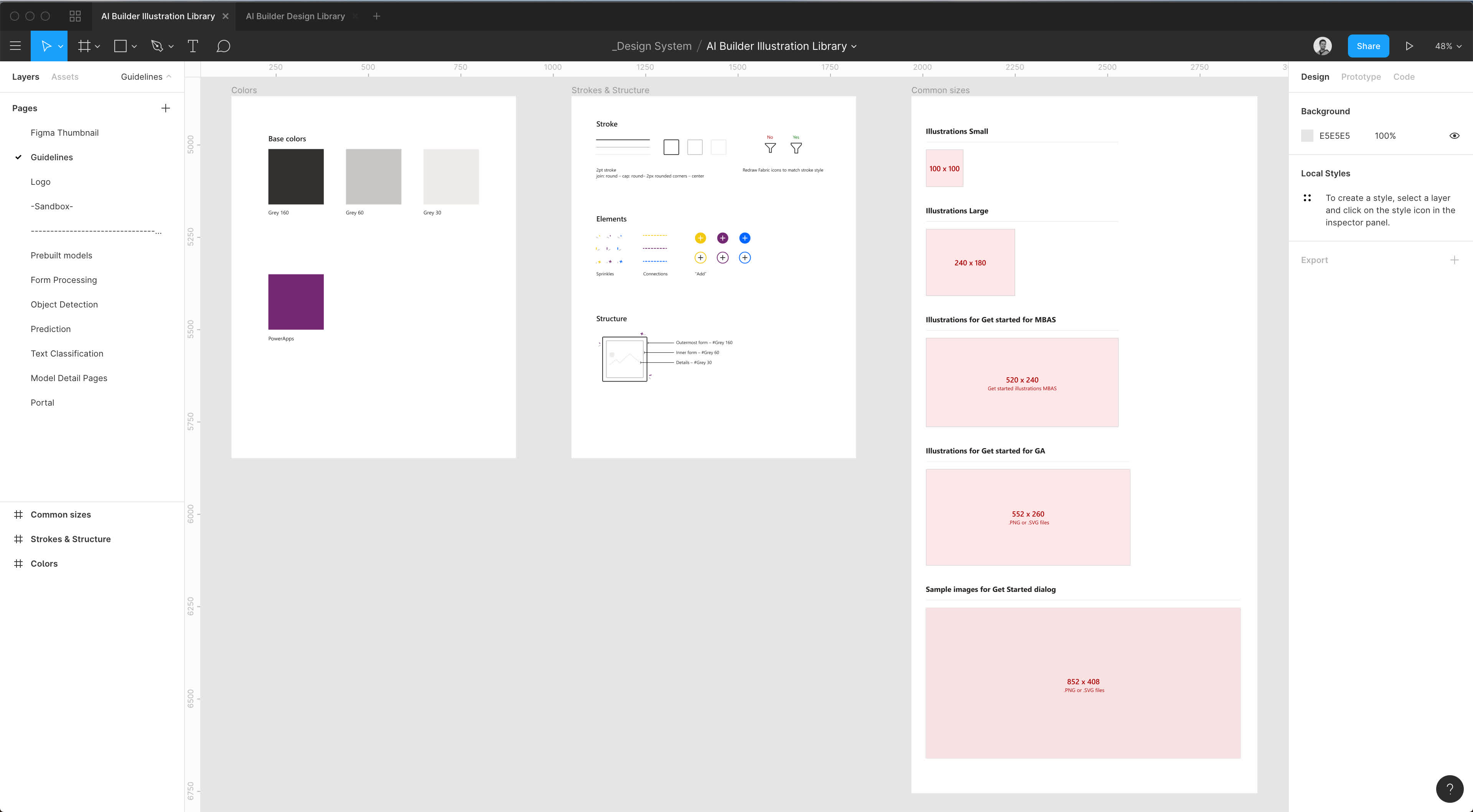
Design System
Team Management
Challenge

Project overview

Leveraging AI to improve company processes and decision making is not an easy task for businesses as it requires hiring teams of developers and data scientists to build tailored AI models or integrating ready-made AI offerings that have limited customization. Both solutions come at a high cost. They can take years to generate return with uncertain outcomes as well as ethical and security concerns associated with AI. Our goal was to abstract all the complexity of AI models and provide an intuitive experience that lets our persona (a no code - low code user) build and customize AI solutions with ease.

I lead the AI Builder Design Studio. I'm responsible for the creative direction and product innovation. I’ve hired, onboard, and mentor a multi-disciplinary design team of product designers, motion designers, content strategists, and user researchers, spanned across Seattle and Paris.

Video

Watch the video

Gallery

Some sreenshots

No items found.
Challenge

Project overview

In 2014 Xbox Music was rebranded Groove Music. We joined the Release Studio team under the direction of Claudio Guglieri to focus our attention on the Groove apps. One of my first challenges was to improve the first-run experience with a more engaging and personalized experience.

  1. Increase Microsoft Groove usage
  2. Improve retention by providing personalized content that’s always fresh
  3. Improve App rating
Responsabilities

My Role

I joined the Groove universal app team as a product designer under the supervision of Claudio Guglieri. My focus was to revisit our onboarding experience to make it more personal and delightful. I worked closely with the research team to identify our problem statements and define opportunities. I created user flows, wireframes, prototypes, motions, redlines, and collaborated with the engineering teams for building the concept on Windows 10, Mobile (iOS & Android), and Xbox consoles.

Methodology

Design process

Emphatize

Understand the experience, situation, and emotion of our target users.

User Interviews
Personas
Define

Synthesise the findings to have a clear understanding of the problems and pain points.

Problem definition
Pain points
Ideate

Explore a wide variety of ideas to solve solutions to a problem.

Competitive analysis
Brainstorm solutions
Sketches
wireframes
Prototype

A simple, cheap and fast way to shape ideas to test them.

Invision
Principle
Test

Ask for feedback on your prototypes and iterate on the ideal solution.

Guerilla testing
User testing
emphatize

User research

Research helped us identified two main personas. The file activates user and the music streamer. We recruited six participants using the Groove Application to better understand their journey. All participants mentioned they have a valuable collection of music they maintained but also used different kinds of music streaming services. We then ask all participants to use the Groove application to perform two tasks. Open a music file from their local drive and discover new music from our service. For the first task, most participants communicated that they were anxious during the cold start experience when asked to choose a free trial before using the product. For the second task, all participants succeeded in discovering new music. Still, most participants said that it was a tedious task.

Define

Main problems

1/ Building a music collection takes time

New users have to dig in our catalog of songs and playlist to find music they will like and start building a collection.

2/ New users doesn't get music recommendations

The cold start experience isn't optimized for new users has we only propose New and Popular content.

Prototype

Taste profile concepts

The main goal of the taste profile is to gather signals from the user with a fun and delighting experience to provide personalized recommendations later on in the service. I've created several design prototypes in Framer and Origami to get a better sense of the user experience and use them in user studies to get feedback.

Taste Profile

Concept 1

I started this concept on mobile. The swipe interaction started by Tinder was a good fit for this experience. The user will start with some music Genres, and based on his selection we would ask him to pick five artists.

Taste Profile

Concept 2

Like the fist concept the user has to pick some genres first and then a few artists. The interaction here is simpler and less linear. The user decides how many inputs he'd like to give. The main down side of this experience was the lack of music samples on the artist selection.

Taste Profile

Concept 3

The third concept is similar to the second one but with a different visual treatment. The participant did like the possibility to search but prefers to see artists' images.

Taste Profile

Concept 4

With this concept I wanted to explore the concept of a vertical scroll timeline. Based on the user selection the timeline would refine and propose more accurate recommendations.

Taste Profile

Concept 5

For the last concept I wanted to explore a different interaction to discover related artists.

Test

Hallway testing to gather feedback

With the different prototypes created, I recruited 8 participants from our office but not familiar with the product. My goal was to iterate and get fast feedback quickly. The results were enlightening and helped us frame the direction of the taste profile. Below are some key insights from the participants.

“I saw a similar experience on Netflix. Here I'm giving you inputs for music recommendations, can wait to see the results”
Carolina
  —  Netflix user
“Hearing a sample for these artists is really cool. I listen to a lot of music but I always forget the names."
JOSEPH
  —  Listen to music everyday
“I prefer when I see the artist image instead of just the names, I'm a visual person, it helps a lot”
sandra
  —  Casual music listener
“I would love to get back to this experience once in a while to edit my profile”
david
  —  Music creator
Iterate

End to end flow

Thanks to user feedback, I had a better understanding of the final concept I'd like to build. The timeline approach was the most interesting and scalable solution for users to build a taste profile while discovering new music. Here is a overview of the end to end experience for a new user starting Groove for the first time.

Step 1 of 9

Start Groove

User open the Windows Start menu and select the Microsoft Groove application

Step 2 of 9

Welcome screen

The first screen the user will see is the Welcome screen. Clicking on Get started will launch the Taste profile.

Step 3 of 9

Taste profile

The taste profile is divided in two parts, the header that contains a search and an infinite list of genres and artists.

Step 4 of 9

Taste profile feed

The feed is composed with 80% of suggested content based on previous selection and 20% of new content.

Step 5 of 9

Add artists

The user can mouse hover a tile to hear a 30 seconds preview of the most popular track from an artist and click on it to add it to his taste profile.

Step 6 of 9

add genres

The user can also add music genres to his taste profile.

Step 7 of 9

Validate taste profile

Once we have a minimum of 5 seeds, a floating button becomes available for the user to validate his selection.

Step 8 of 9

sucess screen

While we generate the playlists based on the user selection, we display a success screen with artists and genres tiles. Once all the recommendations are ready, the user can navigate to his personalized page.

Step 9 of 9

Your groove

With the taste profile, we will automatically generate a feed of personalized content for the user. Also, we will add the artists selected to the user's collection. This allows the Groove cold start experience to be more personalized and filled with meaningful content.

Solution

Taste profile experience

We ended up choosing the Timeline experience and refined the interaction to make it easy to understand and accessible on Mobile and Console.

Final note

Takeaways and next steps

This project was exciting and fun to design. Finding the right concept and creating high fidelity prototypes was really challenging. I'm used to low fidelity prototypes, but here we needed an end to end solution that could react to the mouse position, touch gestures, and output sound based on particular conditions. Playing with Framer and Origami was a lot of fun.

With the Music Taste Profile concept finalized, my next step is to move the consumption experience within Groove to optimize the music discovery experience. Make sure to check the Your Groove case study to learn more.

Challenge

Project overview

In 2014 Xbox Music was rebranded Groove Music. I joined the Release Studio team under the direction of Claudio Guglieri to focus our attention on the Groove apps. One of my challenge was to revisit the music discovery experience and improve the retention rate.

  1. Increase Microsoft Groove usage
  2. Improve retention by providing personalized content that’s always fresh
  3. Improve App rating
Responsabilities

My Role

I joined the Groove universal app team as a product designer under the supervision of Claudio Guglieri. My focus was to revisit the music discovery experience and make it more personal and tailored to our user's taste. I worked closely with the research team to identify our problem statements and define opportunities. I created user flows, wireframes, prototypes, motions, redlines, and collaborated with the engineering teams for building the concept on Windows 10, Mobile (iOS & Android), and Xbox consoles.

Methodology

Design process

Emphatize

Understand the experience, situation, and emotion of our target users.

User Interviews
Personas
Define

Synthesise the findings to have a clear understanding of the problems and pain points.

Problem definition
Pain points
Ideate

Explore a wide variety of ideas to solve solutions to a problem.

Competitive analysis
Brainstorm solutions
Sketches
wireframes
Prototype

A simple, cheap and fast way to shape ideas to test them.

Invision
Principle
Test

Ask for feedback on your prototypes and iterate on the ideal solution.

Guerilla testing
User testing
emphatize

User research

Research helped us identified two main personas. The file activates user and the music streamer. We recruited six participants using the Groove Application to better understand their journey. All participants mentioned they have a valuable collection of music they maintained but also used different kinds of music streaming services. We then ask all participants to use the Groove application to perform two tasks. Open a music file from their local drive and discover new music from our service. For the first task, most participants communicated that they were anxious during the cold start experience when asked to choose a free trial before using the product. For the second task, all participants succeeded in discovering new music. Still, most participants said that it was a tedious task.

Define

How might we?

1/ How might we help our users to discover new music tailored to their music tastes?

2/ How might we make the discovery experience as easy as one click?

3/ How might we make our proposal simple and transparent so our users know what to expect and when?

Ideate

User flows

To get a clear overview of the end to end experience, and make sure that I don't miss a use case, I've laid down the different user paths from launching the Groove application to browsing recommended music.

Ideate

Competitive analysis

To better understand how our competitors solve these problems, I audited Spotify and Apple Music. Both of them are mostly focusing on playlists to help their users to discover new and fresh content. Spotify releases 55 new playlists a week while Apple music releases 50 playlists a week.

Playlist analysis

Spotify

Spotify generates 55 playlists a week

Playlist analysis

Apple music

Apple Music generates 50 playlists a week

Ideate

Design explorations

The main concept was to leverage the Music Taste Profile to populate the Your Groove page with meaningful content tailored to the user music taste. I've proposed two main concepts to the leadership team. The first one was around a customized radio that leverages a natural language form contextual to the day of the week and the time of the day. While it was an interesting concept, we thought it wouldn't give enough options to the user.
We choose the second concept, which puts playlists at the center of the experience. The page is divided into two main sections, with three main playlists at the top. These playlists give our users a go-to destination every time they start the application. The rest of the page is filled with additional channels of different content types (Albums, Playlists, Radios) and sources (User collection, Groove catalog).

Prototype

Preview playlist content

I then focused on improving the discovery of new content by allowing our users to preview the top three playlists without entering them. I defined some high-level principles and quickly moved into Framer and Origami to create several interaction prototypes.

Desktop interaction

Concept 1

For this first concept, I started to look at how we would showcase content within the playlist with a mouse enter interaction.

Desktop interaction

Concept 2

For this second concept, I started to work on how users will be able to preview music content directly from the playlist tile.

Desktop interaction

Concept 3

With this iteration, I've refined how we could showcase that a track is loading and playing to improve accessibility and set expectations.

Mobile interaction

Concept 4

I then ported the preview playlist concept to Mobile and investigated how this would work with touch gestures.

solution

Your Groove experience

Final note

Takeaways

With the Taste profile and the Your Groove page, we now have an end-to-end solution that helps new users to get a personalized music experience even on the first launch. It also encourages our recurrent users to come back several times a week to discover new content and get personalized and contextual recommendations. We confirmed this hypothesis as we notice a 7% increase in active users since the launch of this feature.

Challenge

Project overview

In 2014 Xbox Music was rebranded Groove Music. I joined the Release Studio team under the direction of Claudio Guglieri to focus our attention on the Groove apps. One of my challenge was to revisit the discovery experience and improve the retention rate.

  1. Increase Microsoft Groove usage
  2. Improve retention by providing personalized content that’s always fresh
  3. Improve App rating
Responsabilities

My Role

I joined the Groove universal app team as a product designer under the supervision of Claudio Guglieri. My focus was to revisit the music discovery experience and make it more personal and tailored to our user's taste. I worked closely with the research team to identify our problem statements and define opportunities. I created user flows, wireframes, prototypes, motions, redlines, and collaborated with the engineering teams for building the concept on Windows 10, Mobile (iOS & Android), and Xbox consoles.

Methodology

Design process

Emphatize

Understand the experience, situation, and emotion of our target users.

User Interviews
Personas
Define

Synthesise the findings to have a clear understanding of the problems and pain points.

Problem definition
Pain points
Ideate

Explore a wide variety of ideas to solve solutions to a problem.

Competitive analysis
Brainstorm solutions
Sketches
wireframes
Prototype

A simple, cheap and fast way to shape ideas to test them.

Invision
Principle
Test

Ask for feedback on your prototypes and iterate on the ideal solution.

Guerilla testing
User testing
emphatize

User research

Research helped us identified two main personas. The file activates user and the music streamer. We recruited six participants using the Groove Application to better understand their journey. All participants mentioned they have a valuable collection of music they maintained but also used different kinds of music streaming services. We then ask all participants to use the Groove application to perform two tasks. Open a music file from their local drive and discover new music from our service. For the first task, most participants communicated that they were anxious during the cold start experience when asked to choose a free trial before using the product. For the second task, all participants succeeded in discovering new music. Still, most participants said that it was a tedious task.

Define

Three main problems

01

Many users don't use Groove to stream music

Recurrent file activates users don't see the value of Groove. For them, Groove is just the a player that plays music from their local drive.

02

Building a music collection takes time

New users have to dig in our catalog of songs and playlist to find music they will like and start building a collection.

03

No personalized experience

Recurrent Groove users expect to see fresh music tailored to their taste every time they visit the application.

Ideate

Convert file activate users

We looked at the telemetry and notice that 70% of users who start the app don't stream music. With additional research, we discovered that most of these users are those who usually open media files directly from folders instead of using corresponding apps. A lot of these users are not adopting Groove to manage their music and keep launching it through a file activate (aka. Recurrent file activate users). How can we slowly transition these users in using Groove to organize their local collection and ultimately upsell them to the premium experience?

File activate

music folder

User goes to his local music folder to play a song from his favorite artist

File activate

Now playing screen

Groove opens on the Now Playing screen. Thanks to the Groove Scrapper, the song is identified, and all the relevant metadata are displayed. In parallel, we automatically provide a list of similar songs so the user can continue exploring new music on the service. Lastly, we automatically scan the local folder and add the two songs to his Groove collection.

File activate

Album page

Switching to the album page, the user will now see songs from his collection organized by albums. Clicking on an album will show the album page with the artist's discography and similar artists.

File activate

Artists Library

Inside the Library the user will see a prompt asking to point Groove to his main music folder.

File activate

Adding local music

In a few second the user was able to bring all his local music inside Groove. Groove was able to recognize and organize all his music.

Prototype

Personalized onboarding

With the flow for the file activates user optimized, I then focused on the second persona the music streamer. To reduce churn, I decide to focus on the cold-start experience to improve the music personalization. The main goal is to gather signals from the user with a fun and delighting experience to provide personalized recommendations later on in the service.

Taste Profile

Concept 1

I started this concept on mobile. The swipe interaction started by Tinder was a good fit for this experience. The user will start with some music Genres, and based on his selection we would ask him to pick five artists.

Taste Profile

Concept 2

Like the fist concept the user has to pick some genres first and then a few artists. The interaction here is simpler and less linear. The user decides how many inputs he'd like to give. The main down side of this experience was the lack of music samples on the artist selection.

Taste Profile

Concept 3

The third concept is similar to the second one but with a different visual treatment. The participant did like the possibility to search but prefers to see artists' images.

Taste Profile

Concept 4

With this concept I wanted to explore the concept of a vertical scroll timeline. Based on the user selection the timeline would refine and propose more accurate recommendations.

Taste Profile

Concept 5

For the last concept I wanted to explore a different interaction to discover related artists.

Test

Personalized onboarding

I've created several prototypes on Mobile and PC and tested them with 8 participants found in the office but not working the product. The results were enlightening and helped us frame the direction of the taste profile. Below are some key insights from the participants.

“I saw a similar experience on Netflix. Here I'm giving you inputs for music recommendations, can wait to see the results”
Carolina
  —  Netflix user
“Hearing a sample for these artists is really cool. I listen to a lot of music but I always forget the names."
JOSEPH
  —  Listen to music everyday
“I prefer when I see the artist image instead of just the names, I'm a visual person, it helps a lot”
sandra
  —  Casual music listener
“I would love to get back to this experience once in a while to edit my profile”
david
  —  Music creator
Solution

Taste profile experience

We ended up choosing the Timeline experience and refined the interaction to make it easy to understand and accessible on Mobile and Console.

Challenge

Project overview

Browsers have been around since the early days of the internet. Innovation over the years has emphasized speed, compatibility and safety. But what people do on the web is so much more than just browse.

Our goal was to expand the type of content you can read within your browser and make it accessible to all users. We wanted users to have the best reading experience, allowing them to interact with the book in the same way they might do with a physical book but with more opportunities to enhance their understanding and engagement, with learning tools, notes, highlights, doodles or Cortana. I led a team of 5 designers to design the Windows Books Apps on five platforms (Windows 10, Xbox, Windows Phone 10, iOS and Android mobile and tablet). I've defined the scope and product vision, doing wireframes, user flows, visuals, prototypes, user tests, motions, redlines and supervised the quality of the development until releasing to production. We worked closely with three scrum teams in Paris and two design teams based in Redmond (GMT-7) and Hyderabad (GMT+5:30) working on other parts of EDGE.

Responsabilities

My Role

I was the design lead for Books in Edge defining the user experience and visual direction on Windows 10, WP10, iOS and Android mobile and tablet. I was leading a small team of two junior designers and worked closely with three scrum teams in Paris and two design teams based in Redmond (GMT-7) and Hyderabad (GMT+5:30) working on other parts of EDGE. I've defined the scope and product vision, doing wireframes, user flows, visuals, prototypes, user tests, motions, redlines and supervised the quality of the development until releasing to production.

Methodology

Design process

We did a comprehensive competitive analysis and ran several user studies with a diverse panel of readers. The goal was for us to have a good understanding of the market and ensure our product brings unique values to our users. Once the project planning was ready, I've built and costed a prioritized design backlog to keep track of our progress and ensure we deliver designs on time. With two junior designers in the team, I decided to create a design process to follow to ensure they have a good understanding of the problem before jumping too quickly on solutions while still giving them some room for autonomy. It consisted of a OneNote page that the designer would fill with, a problem definition, success metrics, list of job stories, competitive analysis, user flows and lastly links to prototypes and visuals.

Emphatize

Understand the experience, situation, and emotion of our target users.

User Interviews
Personas
Define

Synthesise the findings to have a clear understanding of the problems and pain points.

Problem definition
Pain points
Ideate

Explore a wide variety of ideas to solve solutions to a problem.

Competitive analysis
Brainstorm solutions
Sketches
wireframes
Prototype

A simple, cheap and fast way to shape ideas to test them.

Invision
Principle
Test

Ask for feedback on your prototypes and iterate on the ideal solution.

Guerilla testing
User testing
Research

User interviews

Research showed that users under age 30 are more likely to read their e-books on a phone or computer than on an e-reader or tablet. Additionally, the tablet is the preferred device for long-form reading, but the phone is often used when the tablet is left at home.

Users favored the computer for scenarios where they needed to learn, take notes, highlight content. Users plebiscite e-books over printed books when they are searching for a new book to read quickly. Lastly, e-books are easier to take with you when traveling or commuting and can enhance the reading experience with accessible content and rich media.

I enjoy being able to read any of my books wherever I am. I always have my phone on me, therefore my books come with me.

Factors discouraging e-book usage

Prefer reading printed books
27%
Looking at a screen for too long
24%
Like owning a printed book
23%
Don’t like reading from screen
22%
Cost of device to read ebooks
22%
Less suitable as gifts
17%
Print book are easier to read anywhere
15%
Not easy to lend or borrow
14%
Don’t know enough about ebooks
11%
Less suitable for children
9%

Factors encouraging e-book usage

Space compare to printed books
23%
Cheaper than printed books
21%
Easier to carry
21%
Easy to download
19%
Can download sample for free
17%
Better for environment
15%
Wide range of title available
11%
Can adjust font and book theme
11%
Can search in book
9%
Extra content such as audio and video
7%
Typically I start on the iPad and then if I am really into it, I will switch to my phone since I don't have my tablet on me all the time.
Research

Three main problems

01

Reading experiences not available everywhere

A lot of users mentioned that they tried to read digital books but that their experience was limited to one platform

02

Users don't get the value of reading digital books

Many users are hesitant to read digital books as they don't see what are the benefits compared to reading a physical book.

03

Users expect to use digital books like physical books

Some users expect to use a digital book similarly to a physical book (bookmarking, taking notes, highlighting paragraphs...)

Library

Books library

Edge is the central place to manage content that you need to read, or already read, regardless of the content type and source. The books library let you manage your books purchased on the Microsoft Store. Your reading content and progress remain in sync across all your devices. Whether you're online or offline, your books stay with you.

Library

Get recommendations

New users with no books can easily get popular samples directly from the library and start reading their first book in Edge.

Library

Share

Edge has a built-in experience to share your favorite books with your family and friends easily. You can also highlight text in a book and share your highlighted passage.

Reader

Beautiful, engaging and easy to read

Reading a digital book should be fluid and enjoyable. The content beautifully reflows and adapts to my device sizes and reading preferences. Unlike a physical book, the reader provides interactive tools to get the most of your reading experience.

Reader

Customized for you

Most of the users don’t know how Verdana compares to Georgia or Segoe UI. We came up with some simple titles that best describe the font and make the selection easier and more friendly.

Reader

Reading simplified

Books in Edge makes the navigation in a book easy and intuitive. Readers have a very easy way to find exactly what they are looking for using the table of contents. It allows them to jump through chapters, read summaries in some cases, and more.

Reader

Reading designed for Learning​

Use digital ink and annotations to jot down your questions, thoughts and ideas directly on your Books and use Cortana to get answers about content without ever leaving the page you are on​. You can add highlights in four colors, underline, add comments or copy text.

Reader

Read out loud

Hear text read out loud. Just right-click (or press and hold) anywhere on the page and select Read aloud. Read aloud will begin automatically reading at the word you selected.

Reader

Grammar tools

Grammar tools can assist in reading comprehension by breaking words into syllables and highlighting nouns, verbs, and adjectives.

Reader

Reading themes

The user can customize his reading preferences and change font size, screen’s luminosity, select font that best suits his reading habits (news, typewriter, serif, non serif…) and most important of all, change the reading theme.

Design excellence

Design system

With new designers joining the team, the growing number or features, and platform to support. It became clear to me that I needed to invest time in building a robust design system to ease the work of the team and ensure a consistent product.

DEsign system

Materials & Shadows

DEsign system

components

DEsign system

Books cover states

DEsign system

Books cover

Read Our Story

Learn more about our creative team
View All Works

Contact Us

Let’s create something great together